„Through the Ages“

Under the Church of the Redeemer visitors can gain an insight into a period of over 2000 years. They can walk on medieval roads in the cloister, enter an architectural monument of the Roman imperial period with a still active congregational life and can look across the rooftops of modern Jerusalem from the church tower.
"Through the Ages" is the history of the place, from its beginnings until today, and reveals the uniqueness of this place.
A symbol for all


It was important to find a symbol that represents the site in and around the Church of the Redeemer in all its complexity
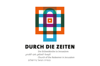
The result is a logo that picks up the floor plan of church, the excavation, the cloister and the tower. It represents the entire site and in its colours envokes associations with those of the stained glass windows of the church. Its individual parts are representative for the four areas of the church complex and are intended to be used in the context of the visitors’ tour.
Multilingual
Church of the Redeemer is a contact point for congregation members as well as for Israeli, Palestinian and international visitors. In this conflicted city it forms a place of peace and peaceful coexistence. For us it is important to implement multilingual design across all media as an expression of "tolerance, understanding and communication".
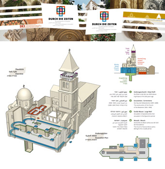
The brochure represents the four parts of the Church (church, excavation, cloister and exhibition, and tower) using pictures, brief texts and a floor plan. For this an equitable solution for the use of four languages had to be found, as well as a balanced typographic design for the two language systems. Due to the wealth of information that had to be conveyed in four languages, a clear structure was particularly important. The colours of the logo are intended to help with orientation. Oblique forms and italics in the layout indicate different temporal layers.
